Automatically Grab Data From an Image with WebPlotDigitizer
Imagine you find a cool graph on the web, and you’d like to see the source data. If it was made in Plotly, that data’s a single click away — either click
if you’re looking at a shared graph, or the data grid icon if you’re looking at the graph in the plot editor. But source data for most other graphs won’t be that easy to access. Here at Plotly, we use an amazing tool called WebPlotDigitizer (WPD) to automatically grab data from a static image.
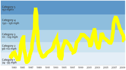
Let’s say, for example, you’re reading this wonderful Mother Jones article on the rising strength of hurricanes. Often, our first thought when we see a graph like this is “that would look great in Plotly!” The source of this data is an academic paper we don’t have access to, but it turns out WPD can grab the data and send it Plotly in a snap! Here’s how:
Step 1, load the image: We saved the image locally (if it were an interactive graph or otherwise tricky to save, we would just take a screenshot), then launched WPD. Next, we clicked
and uploaded our image.
Step 2, define your axes: WPD needs to know the scale of our data, so we clicked
. This prompts us to click two data points on the x axis, then two on the y (both with known values).
This particular graph has an x axis with value labels but no tick marks. To be as precise as possible, we can mouse over a known value, such as the data peak at 1983. Any time you mouse over your WPD graph, the panel in the upper right corner zooms in and displays coordinates as [x,y].
So we knew that, in this example, we could move the mouse straight down and click on the x axis at x = 99 and know that value corresponded to an x value of 1983. Similarly the second x axis point was at an x value of 2009.
We picked y axis values based on the demarcations between the different hurricane categories. We chose one at y = 74 mph and a second point at y = 130 mph
Step 3, acquire data!: Here’s where the magic happens. First, we clicked
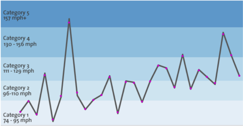
in the top toolbar. Next, we clicked on the right hand side of the screen to access some of WPD’s coolest features. In the auto extract panel, we clicked . This allowed us to use the cursor as a pen to draw over the curve we wanted to extract. The pen tool is best for complex images where the data might be overlayed with backgrounds or annotations. The box tool can be drawn over an entire plot with nothing else in the frame, and the erase tool can undo mistakes in your drawing. When we finished the trace, it looked like this:
Next, we clicked
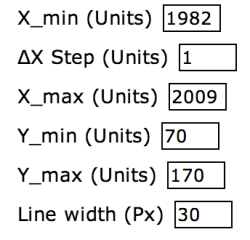
. There are a number of algorithms available to match our traced plot to actual data points. A line graph is just a series of points, connected by lines, so we really want to extract those underlying points. For many line graphs, the data might not be evenly spaced out, or be so densely packed together that we’d want to just graph as many points as possible in order to replicate the source graph. However, in this case, we know that data points occur regularly once every year, starting at 1982 and ending at 2009. That means we can select as our algorithm (we know the step between x values, and the units are years). We then set the parameters as follows:
which told MPD the first and last x values, the fact that data points were 1 year apart, and that — while we didn’t know exact y values (that’s what we want to find out!) — we can put broad upper and lower bounds on y. Remember how I said this is the magic part? Well here’s the result:
Each one of those points is linked to x and y values, which we can view by clicking
. And check this out: your saveable, shareable, interactive Plotly graph is just a click away! Press and your data gets imported straight into a new Plotly graph!
We didn’t build WPD, at first we were just huge fans and frequent users. Its creator, Ankit Rohatgi, integrated WPD with Plotly since he thought it was valuable added functionality. You can check out Ankit’s github page here. As you can see, we’re big fans of each other!
Of course, once we pulled the data into Plotly, we still wanted to tweak and style the graph. The hurricane categories in the background are a stacked bar graph, using a separate x axis scale (read thesetwo blog posts for more info on multi-axis plots). To match Plotly’s colors with the original graphic, there are a number of tools available to you, including:
WPD’s own color picker under → Auto → or →
The DigitalColorMeter program that comes standard with all Mac computers


katepopp liked this
 cruisertom liked this
 sixtoao liked this
plotlyblog posted this