
NOAA (National Oceanic and Atmospheric Administration) has caused quite a stir with their latest report about sea level rise. The statement attracting the most attention is:
Sea level along the U.S. coastline is projected to rise, on average, 10 – 12 inches (0.25 – 0.30 meters) in the next 30 years (2020 – 2050), which will be as much as the rise measured over the last 100 years (1920 – 2020).
The one getting far less attention than it should, is:
Sea level rise will vary regionally along U.S. coasts because of changes in both land and ocean height.
Unlike most of the critics of the report (especially the loudest ones), I actually took the time to read it.
NOAA details what they did to get their many 30-year (short-term) forecasts, including one for each of 8 regions of the U.S. coastline.
Within each region, they first form a “composite” to estimate observed sea level changes over the whole region using the available tide gauge data. This is a tricky business, because you don’t want to remove the average “vertical land movement” (VLM), it’s an important part of Relative Sea Level (RSL) which is what we really want to know — it’s what affects people directly — but you need to compensate for the difference in VLM from one place to another, even within the same region.
Then, they compensate the regional sea level record for known influences like ENSO (el Niño southern oscillation) and PDO (Pacific Decadal Oscillation).
Finally, they take the data since 1970 and fit a parabola, in order to estimate sea level, its rate of change, and its acceleration. Extrapolate that fit to the year 2050, you get their short-term forecast.
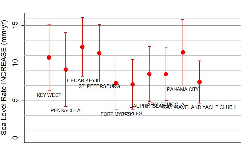
I’ll do something similar, and since Willis Eschenbach urged us to take a look at “any Florida sea level dataset,” I’ll use region 3 as defined by NOAA, “Gulf (of Mexico) East,” because most of that is the Gulf coast of Florida. I retrieved, from PSMSL (Permanent Service for Mean Sea Level), the data for every tide gauge station in region 3 which had at least 360 months’ data (at least 30 years), at least 120 months of which (10 years of which) are since the year 2000 — after all, we do want to know what’s happening now. That leaves 10 stations, eight in Florida, one each in Mississippi (Bay Waveland Yacht Club) and Alabama (Dauphin Island).

Then I aligned their data sets, using my method which preserves the average vertical land movement (VLM) while compensating for the difference in VLM between different stations. I get this composite:

I did not compensate the data for known influences like ENSO and PDO; their impact is beyond doubt, but is also slight (in the long term).
Now we can investigate this series.
The most obvious feature is the clearly visible “uptick” at the end; the composite indicates faster sea level rise recently (since about 2008) than before. Lest you think this is an artifact of my method of alignment, be advised that the “uptick” is clearly visible in every one of the 10 individual records from region 3.
I took each one (before alignment or anything, just the raw data) and estimated the difference in the rate of sea level rise, before and after 2010, and of course I also estimated the uncertainty of that figure. Here’s what I got: note that not only do all stations show a clearly visible uptick, they’re all “statistically significant.”
The important question is, what is the rate of sea level rise, how fast is it rising? The most obvious estimate comes from fitting a straight line (usually by least-squares regression), but that depends sensitively on which data you include. If you use all the data you get one value, but restricting to only the data since 1970 gives a different, significantly larger value. Here are the best-fit straight lines for all the data (in blue) and the post-1970 data (in red):

The difference is “significant” in the statistical sense; it’s not an accident due to random fluctuations, it’s the real deal. Which suggests that maybe the post-1970 estimate is a better estimate, and strongly suggests that the rate itself — the slope of the line (or curve if it’s not straight) — isn’t constant, it has changed over time. When the slope of the curve, when the rate itself changes, we call that acceleration.
And it greatly complicates forecasting future sea level rise. For one thing, when the rate is forever changing (which it seems to be), it’s harder to determine what it is. And even if we know its present value with precision, how will it change in the future? The presence of acceleration — especially of “irregular” acceleration, sometimes faster, sometimes slower — makes it immensely more difficult to know what to expect in the future.
But acceleration there is. It’s obviously present in all the data records from Region 3 (at least, those with enough data to make the cut), and it’s present in hundreds of individual tide gauge records from around the world, as well as every “global average” based on combining tide gauge data, as well as the data from satellite altimeters.
We can at least make a rough estimate of the acceleration itself, by fitting a curve (usually by least-squares regression) which allows for the existence of acceleration. The straight line, as used before, is acceleration-free by definition, so we shouldn’t expect it to detect or quantify the phenomenon.
A curve which does allow acceleration (by not being a straight line), is a parabola. We can do as before and fit this curve (shown in blue) to the entire data set, then try it on just the data since 1970 (shown in red), to get an idea of whether (and if so, how) the acceleration itself might have changed:

Clearly the two estimates don’t agree, and their difference is “statistically significant” (dramatically). Also, they give very different estimates of how the rate of sea level rise changes over time. Here are the rates through time according to the parabolic model applied to all the data (black line with gray shading for uncertainty range) and just the data since 1970 (red line with pink shading for uncertainty range):

It serves to illustrate the essential property of the parabolic model: that although sea level itself follows a curved path (a parabola!), the rate follows a straight line. When rate follows a straight line, it means acceleration is constant. And that is the shortcoming of the parabolic model: it only allows constant acceleration. The real world — and particularly the data from region 3 — don’t seem to behave that way.
I like to estimate how the rate changes by fitting smooth curves which allow for many degrees of freedom, and therefore allow for lots of change in the rate. One of my favorites is the PLF (Piecewise Linear Fit), which fits a function consisting of straight lines which only stay straight for a brief time, then can change direction. Every moment when the rate changes can be called a “knot” (and the PLF itself can be called a “linear spline”). The choice of how many knots to allow, and where to put them, allows for a lot of experimentation to find the “best” values — where “best” means they detect the real changes which are really present, with greatest precision and sensitivity but strict statistical rigor.
Which is a tall order. I’ve settled on knots every 10 years for the sea level series, which allows the rate of sea level rise to change every decade. The model I get (fitting by least squares regression) is this (I didn’t put a “knot” at 2020 because there’s too little data after that to give a decent estimate):

The thick blue line shows the PLF fit itself, the thin blue lines above and below mark its uncertainty range. My program also returns its estimate of the rate at each moment, which actually amounts to an estimate of the average rate between knots (essentially, during each decade). And, of course, the uncertainty of that estimate. Which gives this:
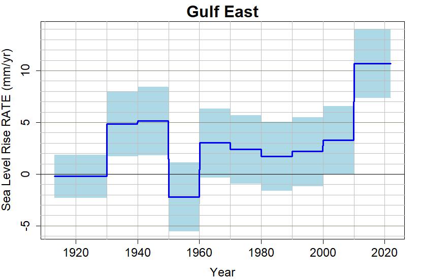
This suggests that the rate of sea level rise has not been constant (so sea level hasn’t followed a straight line), and the rate itself hasn’t followed a straight line either (so sea level hasn’t followed a parabola). Instead, the rate has shown its ups and downs, mainly a dip in the 1950s (when the sea seems to be falling rather than rising), but with a rather remarkable increase to huge levels after 2010. The average rate of sea level rise since 2010 for region 3, is almost 11 mm/yr.
If that keeps up, then in the next 30 years (by 2050) region 3 will get 330 mm of sea level rise, a.k.a. 13 inches, a.k.a. over a foot.
My other favorite method is a lowess smooth (actually, a “modified lowess smooth”), which also requires that I set a “time scale” to control how much fluctuation is allowed. Again, I settled on a time scale of about 10 years, and got this:

What it suggests about the rate of sea level rise, is this (rate in red, uncertainty range in pink):

Again, the rate seems not to be constant (sea level not following a straight line), and the rate seems not to follow a straight line (sea level not following a parabola), but show its ups and downs, with a profound “up” right now, sea level rising at about 11 mm/yr. If that keeps up …
So what does the historical record suggest will happen in the near future? The PLF and Lowess smooths are great (in my opinion) at quantifying what sea level has been doing — but they don’t make any prediction about the future. The linear model does (keep going on the same straight line), but is so obviously wrong — even when using the improved “only since 1970” linear model — that it’s the epitome of foolishness.
The parabolic model is, in my opinion, also obviously wrong, but is nonetheless useful. It gives a plausible “ballpark” estimate of what’s happening now and what will happen over the next 30 years, but only when using the improved “only since 1970” parabolic model.
So I endorse NOAA’s choice of methodology to make their 30-year forecasts, fully aware of the necessary caveats and the incredible uncertainty involved. I have no doubt at all that their chosen model — parabolic sea level rise due to constant acceleration — is wrong, but I also have no doubt that it typifies George Box’s maxim that “All models are wrong. Some are useful.”
In fact, I praise NOAA for making this very difficult choice. It takes courage to tell people the best available forecast, when you know the weaknesses and limitations of that forecast are considerable, but you know that the need is even more imposing.
Here, by the way, is a graphical view of my forecast using their method:
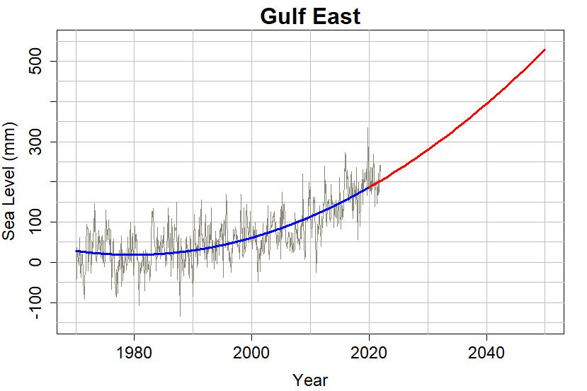
It’s nearly identical to theirs, but I didn’t remove influences of ENSO or PDO and there are other minor differences. They estimate a total sea level rise for region 3 from 2000 to the year 2050 at 0.48 meters, I estimate it at only 0.47 m (over 18 inches). Over a foot of that (13 inches) occurs between 2020 and 2050 (the 30-year forecast).
Region 3 (Eastern Gulf) isn’t the one facing the most dire forecast. That would be region 4 (Western Gulf), forecast for a whopping 0.59 m (23 inches) between 2000 and 2050. Nor does region 3 have the most optimistic forecast; that’s region 6 (Northwest) which is looking at 0.16 m (only 6.3 inches) between 2000 and 2050.
The differences are large, and due to a number of factors. One of the most prominent is land subsidence, especially on the Eastern seaboard. Another is changes in ocean currents, especially the AMOC (Atlantic Meridional Overturning Circulation, sometimes mis-termed the “Gulf Stream”), which profoundly affects sea levels on the east coast and Gulf of Mexico. And, there’s gravity, which changes when large quantities of ice melt and their mass is re-distributed around the globe’s oceans.
It is wise for local planners to pay attention to these forecasts. In my opinion, they are not worst-case scenarios, quite the contrary, they are realistic expectations of what will come. The worst-case scenarios (which involve bad things happening in Antarctica) are a lot worse.
It is especially wise for planners in certain regions — especially the entire east coast and Gulf of Mexico — to pay special attention to the fact (and at this point, it’s not opinion it’s a fact) that they can expect more sea level rise that the rest of the USA.
The numbers are terribly worrisome, it’s true, and the cost of dealing with it will be enormous. But failing to meet this problem while we still have some time to act before we face “crisis mode,” is even more worrisome, and the cost will be unbearable.
Here are the four “key takeaways” from the report:
1.The Next 30 Years of Sea Level Rise
Sea level along the U.S. coastline is projected to rise, on average, 10 – 12 inches (0.25 – 0.30 meters) in the next 30 years (2020 – 2050), which will be as much as the rise measured over the last 100 years (1920 – 2020). Sea level rise will vary regionally along U.S. coasts because of changes in both land and ocean height.
2. More Damaging Flooding Projected
Sea level rise will create a profound shift in coastal flooding over the next 30 years by causing tide and storm surge heights to increase and reach further inland. By 2050, “moderate” (typically damaging) flooding is expected to occur, on average, more than 10 times as often as it does today, and can be intensified by local factors.
3. Emissions Matter
Current and future emissions matter. About 2 feet (0.6 meters) of sea level rise along the U.S. coastline is increasingly likely between 2020 and 2100 because of emissions to date. Failing to curb future emissions could cause an additional 1.5 – 5 feet (0.5 – 1.5 meters) of rise for a total of 3.5 – 7 feet (1.1 – 2.1 meters) by the end of this century.
4. Continual Tracking
Continuously tracking how and why sea level is changing is an important part of informing plans for adaptation. Our ability to monitor and understand the individual factors that contribute to sea level rise allows us to track sea level changes in a way that has never before been possible (e.g., using satellites to track global ocean levels and ice sheet thickness). Ongoing and expanded monitoring will be critical as sea levels continue to rise.
This blog is made possible by readers like you; join others by donating at My Wee Dragon.


It seems to me that we can’t make a better model without a better understanding of the controlling factors. What did happen in the 1950s? The PLF dip is huge, but the MLS change looks more plausible. Does that 1950s dip stay so large if the chunking interval is shifted (ie. not on year 0 of each decade but years, 1,2,3,4)? If not then the extremity of the value is somewwhat a random artifact. But taking the MLS model we still have large fluctuations over (some) decadal periods. Is that just down to water storage on land (i.e effectively cumulative weather in various places) or something else we haven’t really quantified? An optimist could look at the 1970s spike and think that maybe the current rate will come down again. OK, but how far, and why? What drives these variations and should they just be considered very slow noise on a steadily accelerating baseline? How large are the noise effects in comparison to the basic ‘increasing melt/subsiding land’ drivers?
I get the impression that this stuff is still not all that well understood making it very hard to predict SLR more than a decade or two out. But maybe I’m just not well-informed enough?
Thanks for another expert analysis and statistics lesson Tamino.
Game Set Match on SLR.
Would love to see a parallel update of global temperature. Or keeping with the Gulf Coast theme, analysis of black globe, wet bulb, or some other heat stress measure along southern/southeastern US coast. T x RH heat stress may make those areas unsuitable even before SLR and flooding.
My 30-year forecast is that in 30 years we will still see the determined denialati arguing that there is no reason to use anything other than a linear trend starting with the oldest available data.
This just in! According to Don J. Trump, sea level is only going to rise 0.01 inch (0.25mm) over the next 300 years. Thus, an annual average of 0.00085 mm per year. This is 99.992% less, or about 40 minutes worth, relative to the current rate as measured by Tamino. It’s an even smaller fraction compared to future rate increases as temperature warms and as ice shelves in Antarctica and Greenland disintegrate thus removing resistance to prevent land ice flowing into the ocean . The CPAC audience cheered wildly for their incredibly stable genius leader for bringing the clarity of his all-powerful sharpie pen (formerly used to correct hurricane path forecasts) to simplify the complexities of sea level rise down a level understandable to folks whose brains are not burdened with any of the useless nuance caused by layers added onto the reptilian stem over the past hundred million years.
Off topic, but Wow – amazing rainfall over the last few days…
https://www.theguardian.com/australia-news/2022/mar/01/how-the-unprecedented-queensland-and-nsw-floods-unfolded
These one in a hundred year floods seem to be happening about every 15 years now. Yes we have a La Nina, but those floods in Queensland and Northern New South Wales are astounding. Places are flooding which have not flooded before, the water level never got that high before.
As an aside, thanks for the above to Tamino. I am not across the maths but I understand enough stats to see what is going on there. It is a real worry and it is hard to see warming not having an impact on Antarctic ice which will impact sea levels dramatically.
What a mess.
Dear Tamino – In his northwest weather blog, Cliff Mass regularly extends his reach to correct what he sees as exaggerated concerns about climate change progression, causation, extremes, and impacts in the press. The March 3 blog post says that a Seattle Times article, and the NOAA report upon which it was based, are completely wrong. It ends with a challenge/request to “tell me where I got the numbers wrong”. It would educational and perhaps entertaining to see your skills applied to his analysis.
Dr. Mass is a recognized authority on numerical weather forecasting. But I have less confidence in his familiarity with the nuances of climate science given that he
a) Frequently disagrees with people writing on specific subdomains in climate science that they specialize in, whereas Mass is a more generalist in meteorology,
b) Seems to think he knows more about climate than authors of the IPCC reports,
c) Cites Judith Curry and John Cristy as reliable sources (and features a link to the Curry blog on his site), and
d) Seems to be driven by and obsessed with a right-wing vs. left-wing vendetta arising from his public radio talk show being cancelled for unwelcomed comments.
After a recent Mass blog post claimed to debunk the attribution analysis positing that climate change made the 2021 extreme heat dome event X times more likely, I asked one of the authors of that analysis what he thought of the Mass critique. The polite reply was that Mass is not up to speed with the statistical methods used in that analysis.
A replicate of your Gulf Coast SLR analysis for the NW United States and your thoughts about the validity or lack thereof for the NOAA SLR report criticized by Mass would be most appreciated. It is a win-win. If he’s right in debunking hyperbolic climate change threats we need to hear it. If he is turning into an unscientific cranky denialist, we need to know that too because Mass has a large following on his blog site and is an important member of the US meteorology community with influence on NOAA and his many readers.
“It ends with a challenge/request to “tell me where I got the numbers wrong”.”
That’s a laughable challenge. if you rebut any of Cliff’s points he will not post them on his blog. Of course he’s happy to let you post egregious denier nonsense if that’s your thing.
Basically you can trust Cliff for interesting analysis of local weather events but his climate posts tend to be misleading. Sometimes because he doen’t get the science other times he posts intentionally misleading charts.
His idea of advanced statistical analysis is linear least squares, most of his “conclusions” rest on the eyeball test.
Tamino, with the insanity happening in Ukraine you might not have heard about Australia’s unprecedented floods wiping out towns and suburbs in Queensland and New South Wales.
“The city [of Brisbane] got almost 80% of its annual rainfall in only six days up to 28 February, when the system started to move south. Brisbane had only ever recorded eight days of more than 200mm before the 2022 floods. But it saw three in row.”
https://www.theguardian.com/australia-news/2022/mar/05/anatomy-of-a-rain-bomb-scientists-study-phenomenon-2022-australia-east-coast-floods
Climatilogists are saying it’s a one in 1000 year event:
https://www.theguardian.com/australia-news/2022/mar/04/heartbreaking-australias-east-coast-reels-from-worst-floods-in-living-memory
Towns and entire regions are in crisis. Some large towns may never recover. And hundreds of thousands of homes and businesses will become uninsurable.
https://www.theguardian.com/australia-news/2022/mar/05/his-body-was-just-there-mullumbimby-volunteers-confronted-by-horrors-and-chaos-of-flood-aftermath
You might have mentioned that I asked folks to look at “any Florida sea level dataset” FIVE YEAR AGO IN A TOTALLY DIFFERENT CONTEXT REGARDING A TOTALLY DIFFERENT REPORT.
Such selective quoting and pretending I was talking about the current report is totally dishonest.
w.
[Response: Willis,
For years, you have insulted, and made ridiculous accusations against, climate science and climate scientists like James Hansen, and in a fashion which I consider to be snotty and sophomoric. Your attempt at “self-righteous indignation,” I consider exceptional hypocrisy. Truly, I’m impressed.
All I did was mention that you had recommended we look at “any Florida sea level dataset,” and you (pretend to) take umbridge at the fact that I didn’t mention you said that “FIVE YEARS AGO REGARDING A TOTALLY DIFFERENT REPORT.” I thought perhaps readers would already know that, because I mentioned it in the last post.
I also mentioned it five years ago, and linked to your post on the WUWT blog in which you said things like
You also said, regaring the tide gauge datasets from Florida, that
I think you should re-read what I wrote five years ago, because that’s when I proved you were wrong. You also said
Wrong again. Oops.
I really don’t care that you try your poser act of claiming the moral high ground; anyone who reads your posts knows better. I do care about the fact that sea level rise has accelerated, is now rising much faster than in the last century along most of the U.S. coast, and really is going to be an enormous burden on U.S. coastal communities. That includes a lot.
]
Wow, Willis. Projection, much?! Such wounded, offended pride?!
I note in your recent wuwt missive the following quote:
“PS: Although I can and am happy to defend my own words, I can’t defend your interpretation of my words. So I politely request that you quote the exact words you are discussing, so we can all be clear on your subject matter.”
Seems to me that tamino did precisely that. Aren’t you “happy to defend” them? Seems to me also YOU are the one now attempting to mount a new interpretation.
Australia’s La Niña of 2021-22: Brisbane’s cumulative rainfall v long term averages:
https://imgur.com/a/kz6lETG
And it hasn’t stopped raining yet!
From https://www.theguardian.com/australia-news/ng-interactive/2022/mar/03/flood-map-nsw-qld-queensland-rain-chart-maps-brisbane-lismore-gympie-floods-weather-emergency-australia-east-coast