LG has jumped into the big phone fray with the nearly-Note-sized LG G2. The G2 is a spec monster sporting a 5.2 inch, 1080p screen, and it's one of the first phones with a Snapdragon 800. The G2 is going to be the basis for the next Nexus device, so this hardware is of particular interest.
While the G2 is scheduled to launch on all four carriers, LG lacks the negotiating power of Apple and Samsung, so they couldn't pull off launching the same phone on every carrier. We've gotten to use the International, AT&T, and Verizon versions. While the AT&T and International models are identical, we're sad to say Verizon tweaked their version and made a few things worse (we'll point out the differences as we go along).
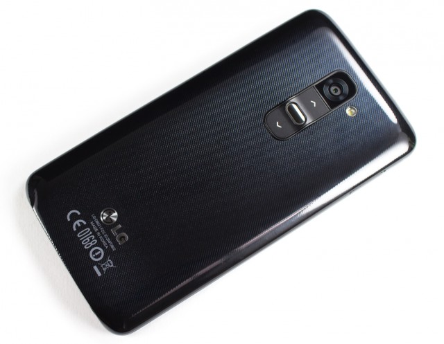
The rear of the G2 takes a significant step backward from its predecessors in the materials department, ditching the glass back found in the Optimus G and Nexus 4 for a glossy plastic material that feels like something from a Samsung phone. The plastic shell is pretty disappointing and feels low-quality. It's not hiding a removable battery—which is how Samsung usually gets away with it—and other than lowering the phone's bill of materials, we're not sure why LG would use something like this. Overall, the build quality is about on par with the Galaxy S4. It feels like a well made, solid object, just made with cheap materials.
In spite of the low-cost feel, the back looks amazing. LG has again decided to adorn their flagship with a unique rear design, this time going with diagonal lines with a reflective inlay. It evokes a feeling of microscopic, polished carbon fiber, minus the weave. The phone looks very classy. Just don't touch it or you'll ruin the illusion.
Weird side note: this back pattern is completely different from what LG showed off to reporters in August.
The Verizon touch
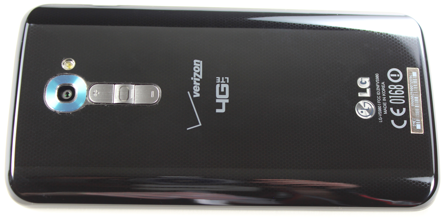
If you're thinking of getting the Verizon version, throw out everything nice I just said about the back. The Verizon variant has a different design that removes the great looking back pattern and buttons, instead using versions that could best be described as "cheaper." The diagonal inlay is gone. It's been replaced with a flat honeycomb pattern that isn't nearly as pronounced, and the sleek looking buttons were swapped out for a tacky sliver plastic. It really looks like Verizon saw the original version and told LG to bring the price down a bit. The result is something that doesn't look nearly as slick as the original.
Hands on—or off
Before I talk about the placement of the power and volume buttons, I should mention my hands-down favorite feature of the G2: "KnockOn." LG has added the ability to wake the phone with a simple double tap of the touch screen. (Yes, just tap twice on the screen and the phone turns on.) The buttons on the back are odd, but this means I never have to use them. Why fumble around for the power when you can just grab the phone, tap twice anywhere on the screen, and get it to work? You can even turn the screen off with a double tap on the status bar or on any blank area of the home screen. This feature changes the way you use your phone, and once you learn to live with it, you'll never want to live without it. After having this phone for a week, I now can't help but double tap my other devices when I want to turn them on. Sadly, of course, it doesn't work.
| Specs at a glance: LG G2 | |
|---|---|
| Screen | 1920×1080 5.2" (423 ppi) IPS touchscreen |
| OS | Android 4.2.2 "Jelly Bean" |
| CPU | 2.26GHz quad-core Snapdragon 800 |
| RAM | 2GB |
| GPU | Adreno 330 |
| Storage | 16GB or 32GB |
| Networking | Dual Band 802.11b/g/n/ac, Bluetooth 4.0, GPS |
| FREQUENCIES SUPPORTED | CDMA (800, 1900 MHz); GSM (850, 900, 1800, 1900 MHz); UMTS (850, 900, 1900, 2100 MHz); LTE (850, 900, 1800, 2100, 2600 MHz) |
| Ports | Micro USB, headphones |
| Camera | 13MP rear camera, 2.1MP front camera |
| Size | 138.5mm x 70.9mm x 9.1mm |
| Weight | 143g |
| Battery | 3000 mAh |
| Starting price | $200 with 2-year contract |
| Other perks | Slimport, USB OTG, 24bit x 192kHz Sound, RGB notification LED |
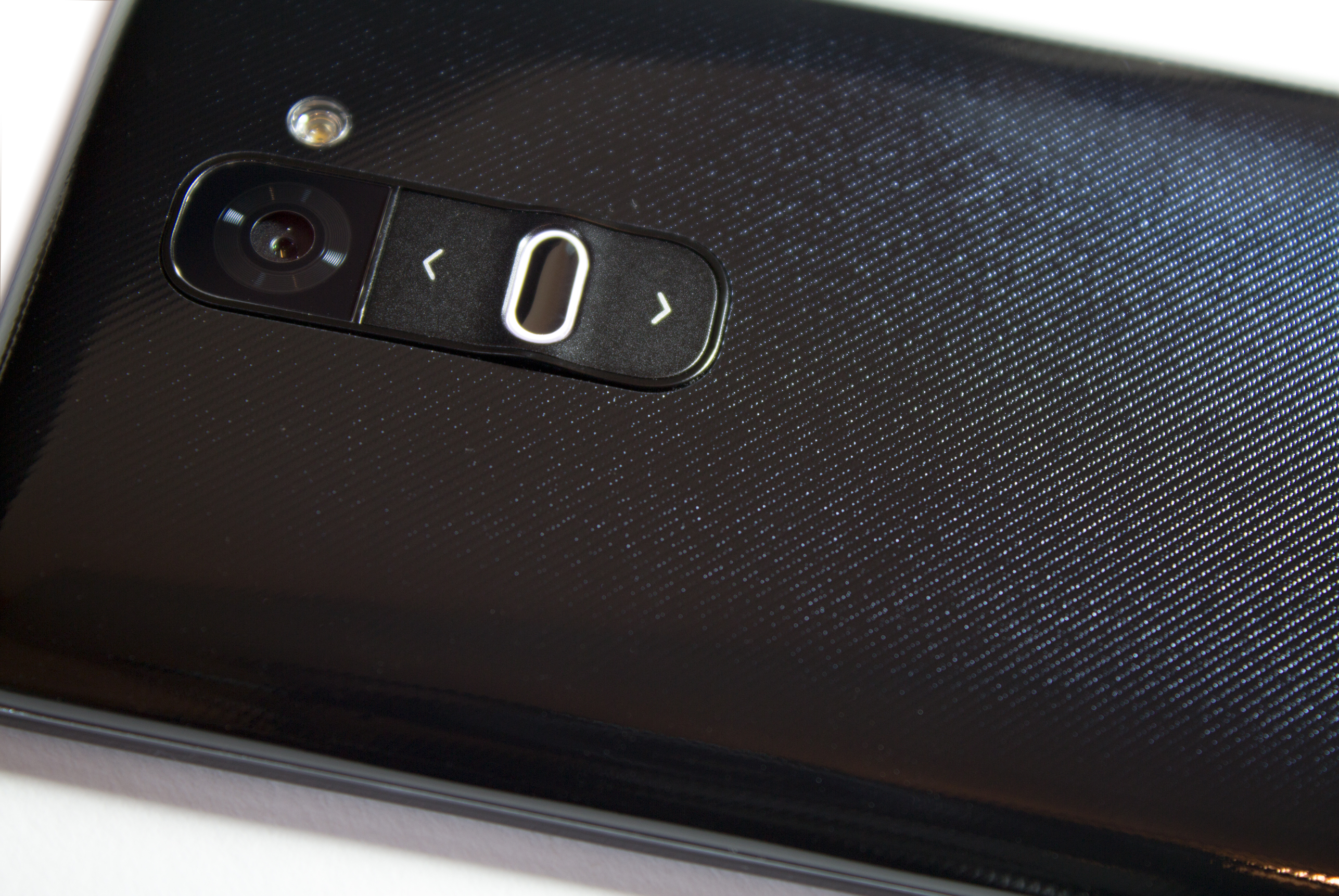
The image above shows the crazy button placement on the nicer AT&T/International version. The power and volume keys are on the back of the phone, just below the camera. The power button placement makes a lot more sense once you consider that its purpose is a secondary means of waking and sleeping the phone. Tap to wake is so much easier and faster than finding a power button, the LG designers probably decided they could shave a few more nanometers off the bezel by moving the button assembly to the back.
Actually using the buttons on the back is a little awkward, but once you get the hang of it, its ease of use is acceptable for how little you use it. When you naturally hold the phone, your index finger tends to rest on the power button. One-handed activation requires a firm grip on the sides of the phone and a press of the index finger. In a car mount, tap to wake works fantastically, but the volume buttons are a lost cause—pick your volume beforehand. The overall button layout isn't great, but it's not terrible either.
The ring around the power button lights up when you press power but not when you have a notification. It seems like it missed an opportunity to have a notification light on the front and back, which would have been handy. The Verizon buttons are smaller and even harder to hit. They're a lot flatter, so they're harder to find with your finger. They also removed the light on the back. Commenters tell me there is some kind of light on the back. There isn't on mine though. Maybe it's broken?
-
One side of the AT&T/International G2.
-
The other side of the AT&T/International version. It has a SIM slot.
-
The bottom of the AT&T/International G2.
-
The bottom of the Verizon G2. Note the mono speaker.
-
The RGB Notification LED on the AT&T/International version
Moving everything to the back of the phone means the sides and top of the phone are essentially blank. One side houses a SIM slot, and that's it.
The bottom of the phone houses the speaker grills, the headphone jack, and MicroUSB slot. The speakers and headphone jack put out fantastic sound. LG has upgraded the audio stack to support 24-bit, 192 kHz playback for FLAC and WAV files, and the company has generally paid special attention to all the audio components.
That's great unless, of course, you have the watered-down Verizon version. This phone has lost an entire speaker grill in the transition to big red. The result is a speaker phone and ringer that doesn't sound as loud.
LG has seen fit to equip the G2 with an RGB notification LED, so notification aficionados can install their favorite LED app of choice and have access to a whole spectrum of colors. This has even survived Verizon's cost cutting.


The screen and front design are the highlight of this phone. The G2 has a beautiful 5.2 inch, 1920×1080 IPS LCD. At 423 DPI, it's not the most eyeball melting pixel density we've ever seen, but it still looks fantastic. It's great to see another high-end phone that doesn't use AMOLED. The colors here are bright and accurate. LG has done a great job shaving down the bezels. The sides are almost non-existent, and the top and bottom bezels are pretty minuscule too. This feels like the closest to an "all screen" device that we've ever come.
The Software
Now on to the software. Oh, the software. You immediately know you are in for a wild ride just by unlocking the G2. Turn on the device, and clouds appear behind the current time and slowly part. The sun lights up in the upper left corner, shining rays of light down upon your lock screen and eventually firing a lens flair across the display. Touching the screen unleashes a light-bending black hole animation surrounded by a continuously bubbling "froth" that expands as you move your finger outward, ripping a void in the fabric of space-time and revealing your home screen underneath. This is the G2 software design in a nutshell. Everything is designed and animated in the cheesiest, most overwrought way possible. If you have any design sensibilities, look away.
The default notification, which you can hear at the end of the video above, is pretty obnoxious. Sure, you can change it, but many people don't do that judging by the amount of Galaxy S3 "bird chirps" I hear in public. Having the default ringtone set to an advertisement just seems tacky.

If you're the type of person who is just fine with the look and feel of Touchwiz, you'll feel right at home. Under all the GPU-powered glitz, LG's software is extremely similar to Samsung's. LG has even copied the trademark Touchwiz gimmicks, like pausing a video when you look away from the screen or picture-in-picture camera modes.
There isn't a single part of the interface LG hasn't bedazzled with their crazy UI paintbrush. The biggest casualty is the notification panel, which is now full of junk. The picture above is of the default setup, which will only show about two small notifications or about 80 percent of a large notification. You can turn off the "Qslide" app section, which will give you use of about half the screen for notifications. Sadly, most of the extra bars can't be controlled or shut off. You'll be scrolling a lot, but thankfully the junk scrolls up with the notifications. And forget about landscape; you see zero notifications without scrolling.

Occasionally LG will take artistic license with an app and slather it in skeuomorphic insanity. There seems to be a few different "sets" of apps, each with different design themes that don't match in the slightest. Above are some of the "brushed aluminum" apps. Compare them to the "settings" screen shown earlier, which is the template for a lot of LG apps.

"Slide Aside" allows you to "store" an app for later with a three finger swipe. Just swipe an app to the left, and later you can recall it by sliding three fingers to the right. That's the theory anyway. The problem with implementing any kind of feature that involves horizontal swiping is that this gesture is taken. Try to do a three-finger horizontal swipe in Gmail, and you will archive some e-mails. In Maps, the screen will scroll. In Google+, you'll delete some notifications. In the Play Store, you'll switch tabs. Horizontal swipes should not be used for anything at the system level; they've been claimed by apps. And this is not necessarily an either/or situation. A lot of times, both things will happen: you'll archive an e-mail and close an app.
reader comments
171